Case study – 2020
Wine label design
Case study – 2020
Wine label design

Description
my role
I was the responsible designer for this vineyard. I did this project for free but paid already back with a good relationship and much good wine.
Links
Problem
understanding
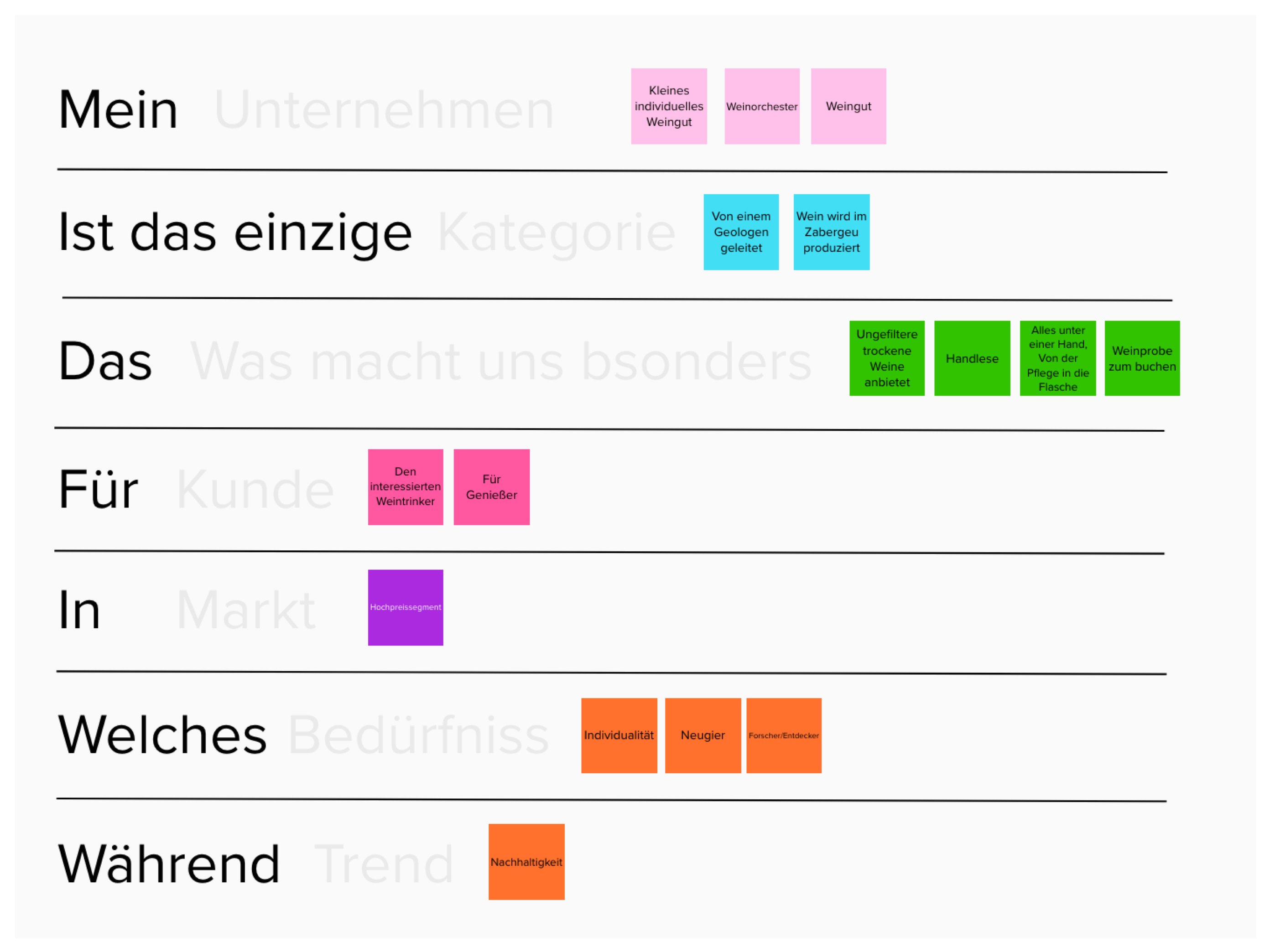
With a little workshop at the beginning, I tried to figure out the current situation and where they want to go. I found out that this is a small private vineyard that grows its vines organically and picking its grapes by hand. Siggi Kraft also studied geology which makes him an obsessed guru about the different kinds of layers of terrain which is very important for the wine to get his unique character. I took a view questions out of the workshop.
- For what does the F in the logo stand for?
- How can we sell and communicate the wine?
- Who wants to buy this wine?
- Which quality has the wine?
- Where can I buy the wine?
Need
Customers need a way to display catalog asset details that will provide protection of actual data and present relevant metadata.
Ideation
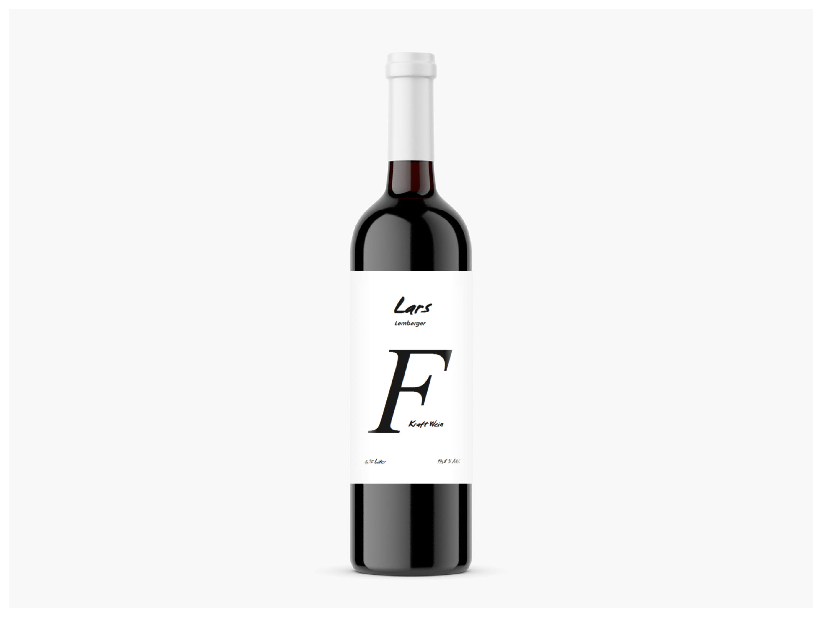
For what does the F stand for? This was the hardest problem for the logo to solve because it’s a physics joke for F = Force translated to german resembles Siggis last name Kraft. He wanted to hold on to this idea and I respected it and tried to integrate the F as smoothly as possible.
Version 1

VERSION 2
VERSION 3
Final design
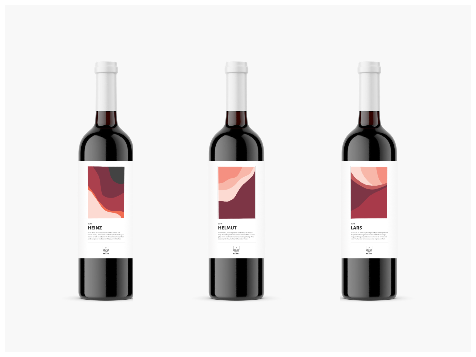
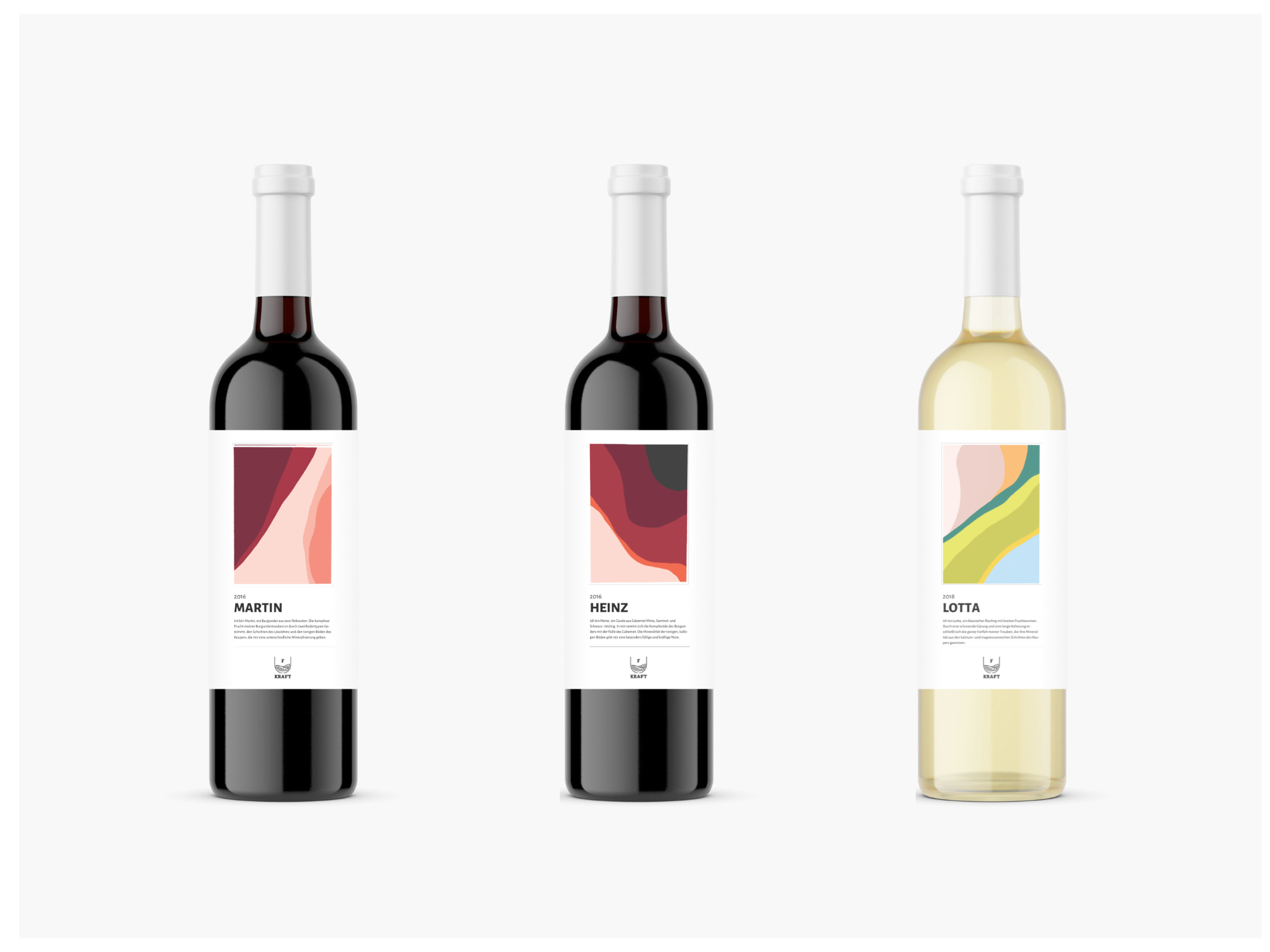
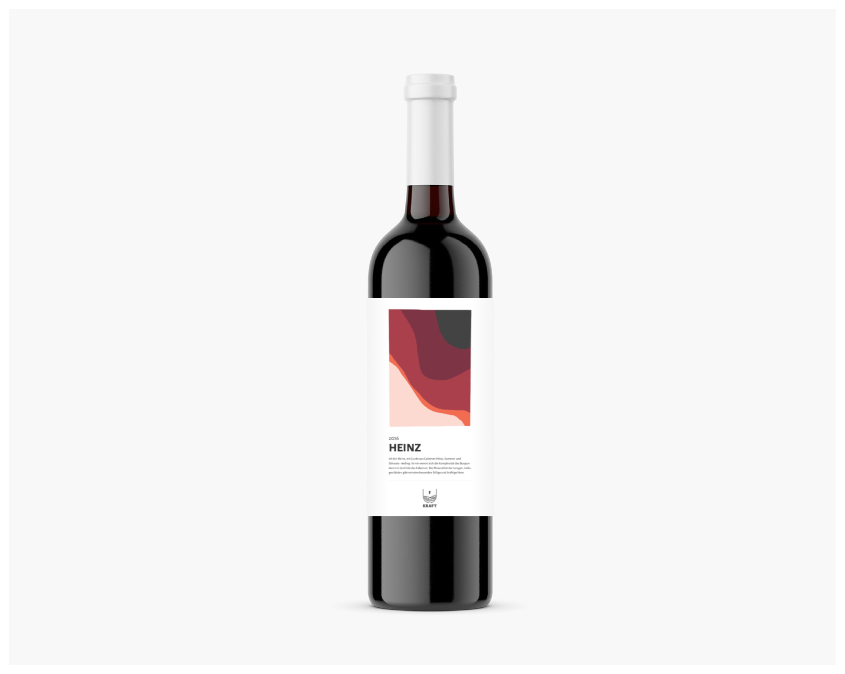
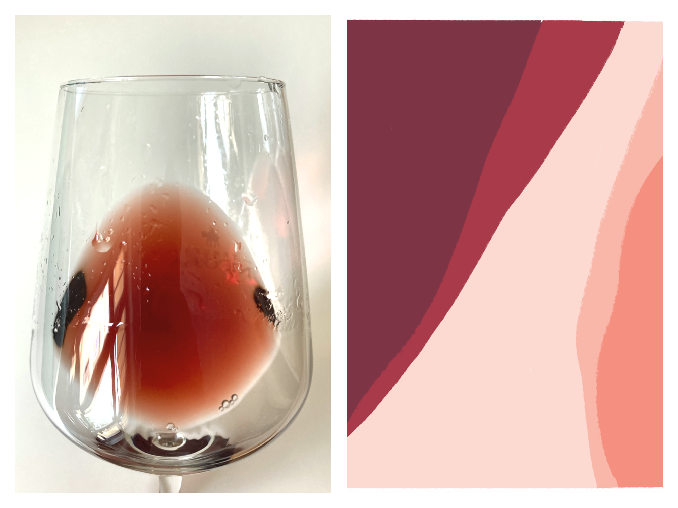
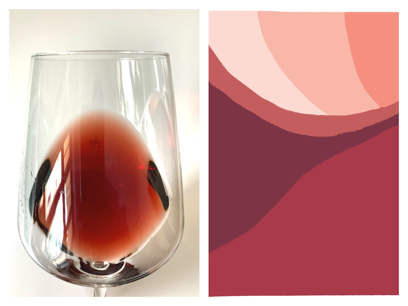
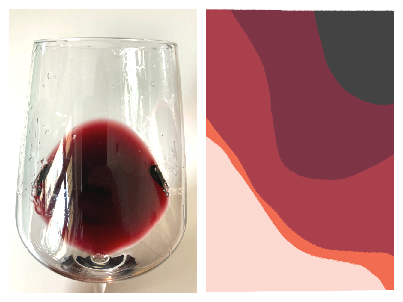
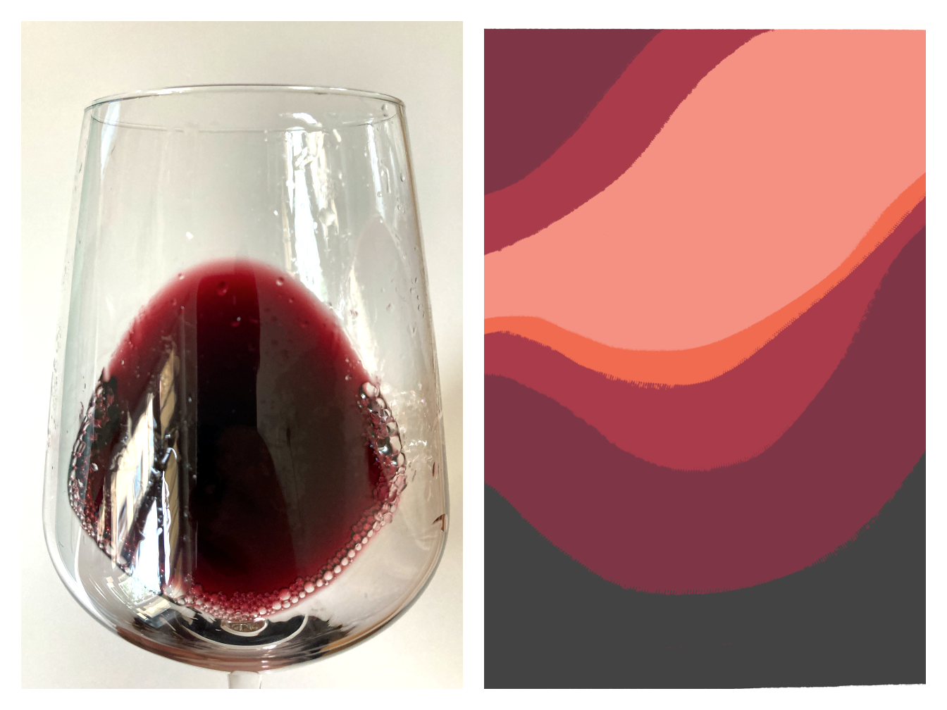
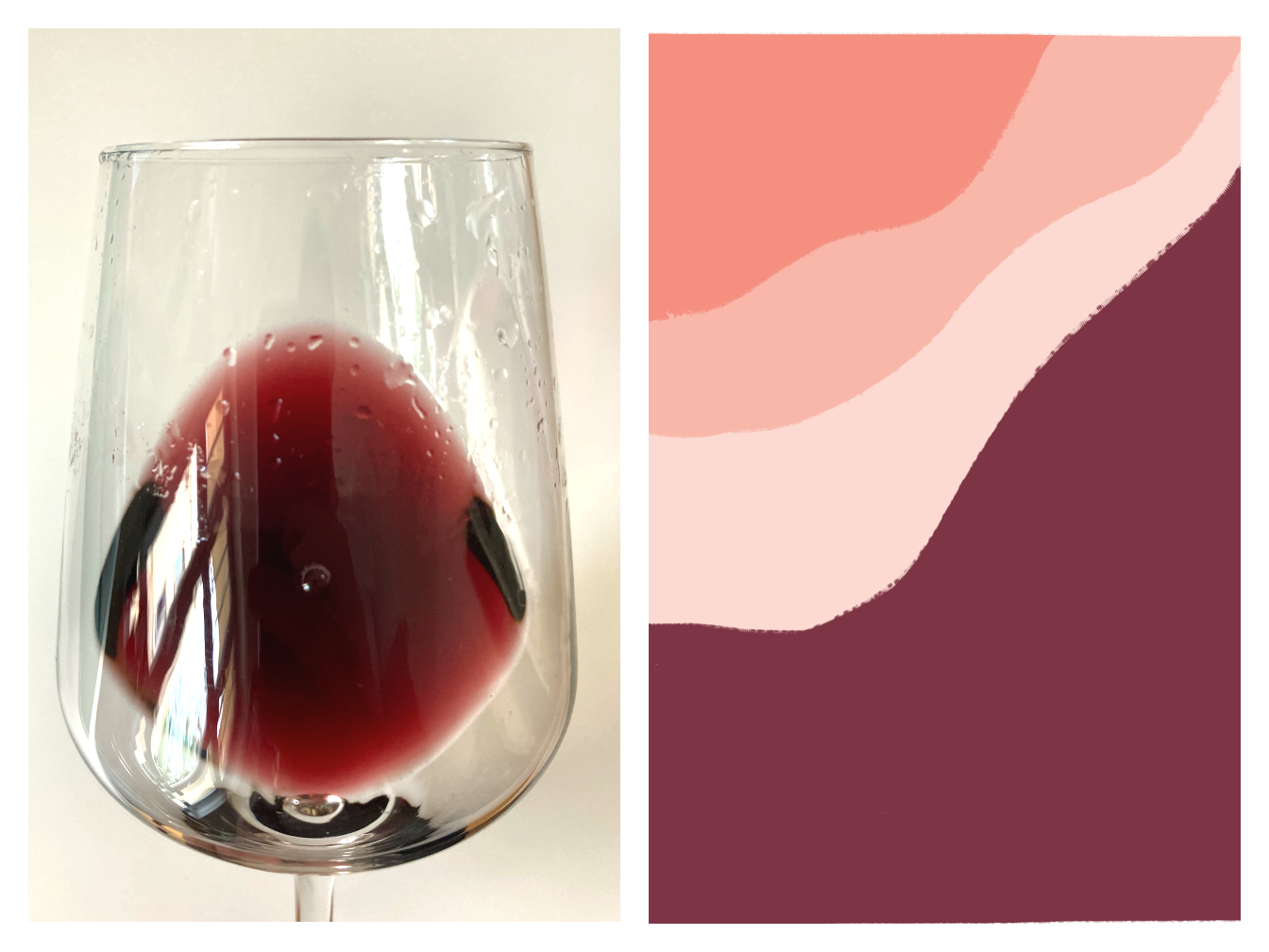
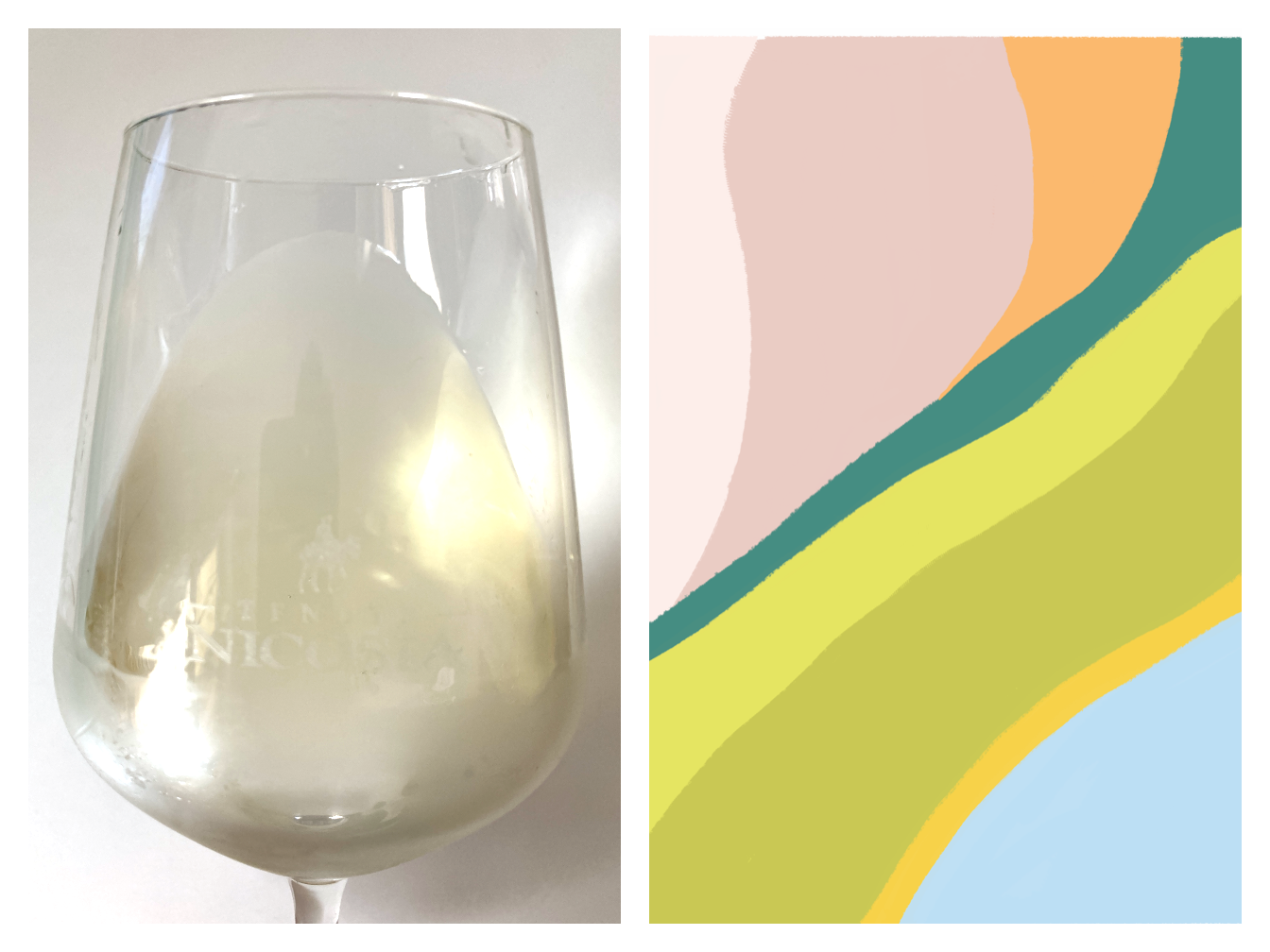
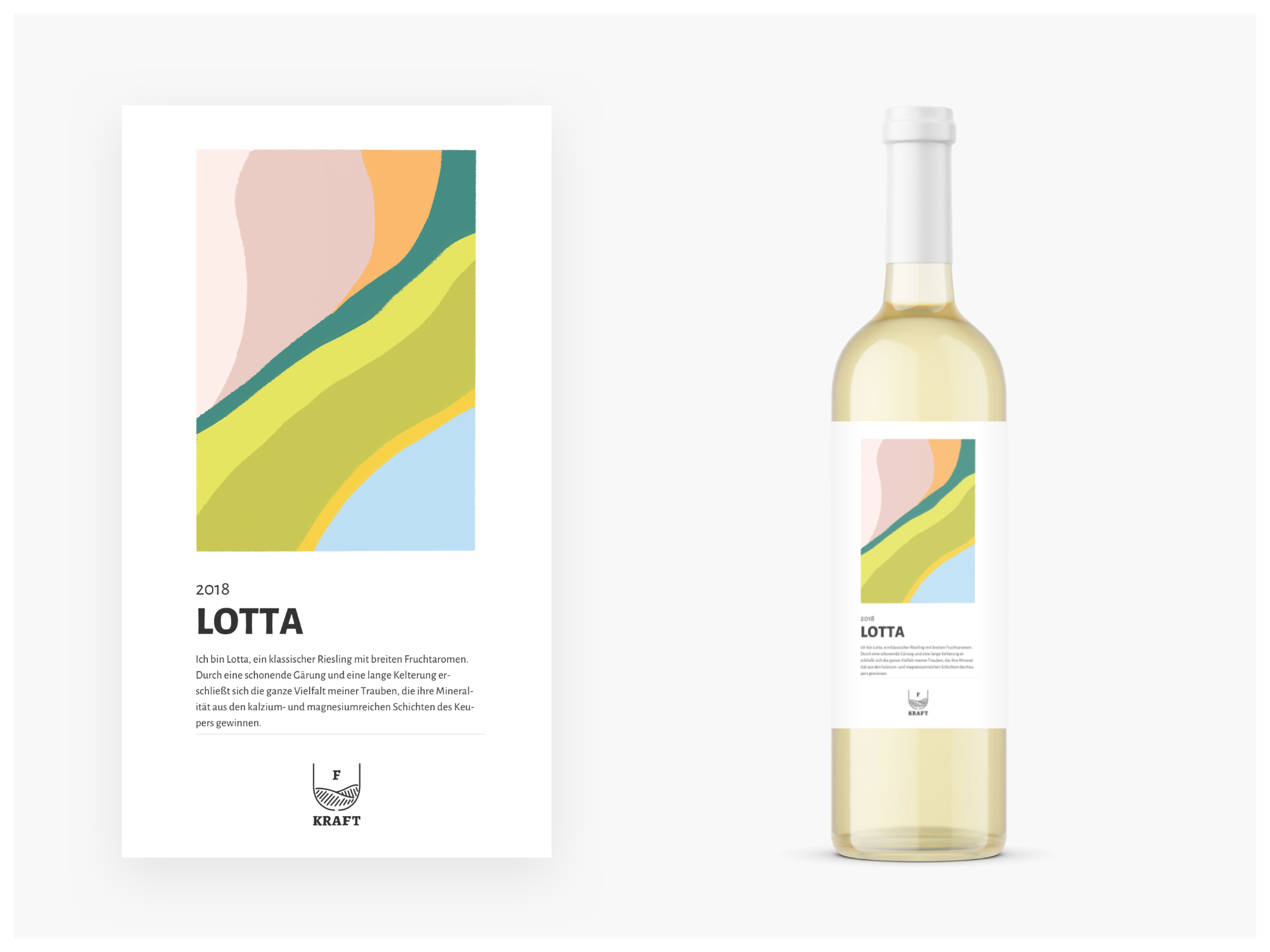
My wife and I did a wine testing a couple of years ago that I found very fascinating. It was maybe a little bit esoteric, about tasting colors but the idea of tasting colors stayed in my head and I pitched this, making the taste of the wine visible with one expressive image to Siggi Kraft. They loved the idea and I went on with it. What I did was a very explorational teasting of the different wines trying to figure out their specialness and simply painted it. The results were very intersting and they liked the idea of seeing this images and also thinking about color and taste of the different wines. This idea was made to stick and Siggie Kraft also wants to make winetasting events out of it.
outcome
Since my studying time people always sad to me that I should never do designs for free or for your family. I learned that sometimes giving your expertise for free at some point also pays back in different ways.
It was a challenge to communicate design language through a high standard with clients that don’t know and care much about design and how it can help them grow their business.
Currently, my duty is fulfilled but not staying in the production line and making sure that the result matches the expectations is very important.
